Making the new Piccalilli logo
The initial logo for Piccalilli was rushed together in about 10 minutes in illustrator and let’s be honest, it was shit.
I hated it pretty much from day one, but wanted to focus on making the newsletter, so just dealt with it. It has been a long running todo of mine to “sort it” though.
One thing that was an absolute priority for this overhaul of Piccalilli was getting a really solid brand in place. I wanted to do it properly too, so I grabbed a trusty Field Notes and started drawing.
Initially I came up with some crap concepts of cute vegetable characters that happen to be ingredients of piccalilli.
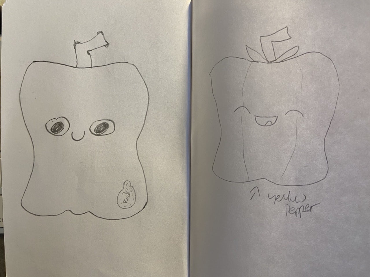
I wasn’t digging them at all, mainly because I am awful at drawing. I focused instead on the spiciness of piccalilli itself (you can really go to town on the mustard and chillis and make a super tasty and spicy piccalilli) and that brought so many more creative ideas.
So, I got back to the sketch book and concentrated on two parts: spiciness and badges (or even food labels).
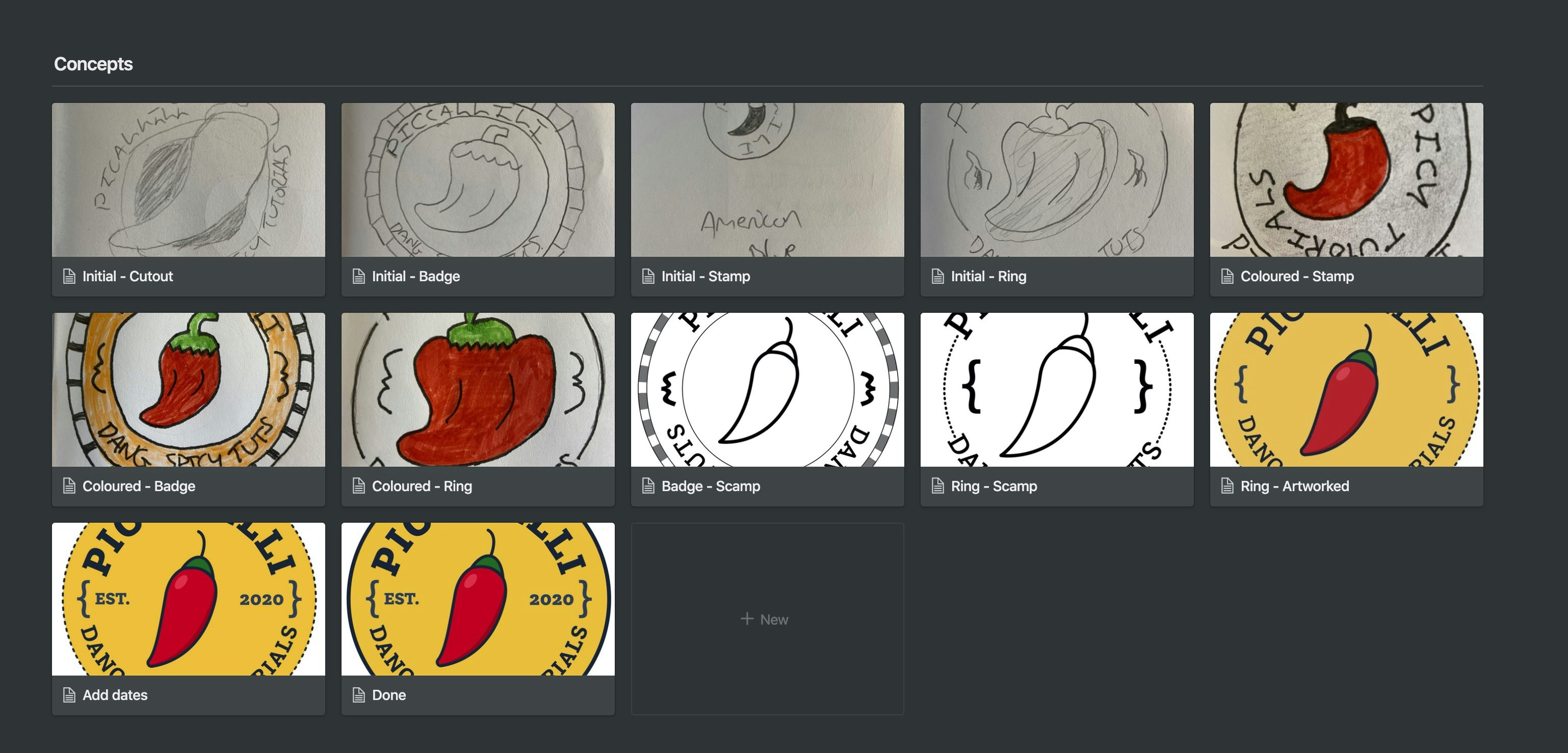
As you can see, all of the concepts were similar and the evolution was pretty dramatic. I really put this down to staying in my notebook for as long as possible and I really recommend this video by Aaron Draplin on his process, because it’s what is lodged in my head now during the rare opportunities I get to do this sort of design.
After all of the work and thinking, here’s the final product:

I’m pretty darn proud of it. Branding and logo design really isn’t my strength as a designer, so I find it very hard. I’m so happy that I persevered with this one though because I feel like it’s improved my skills and confidence as a designer.
This approach of chillies and badges is giving me loads of creative freedom, because there’s a lush colour palette there and I can utilise spiciness to describe tutorial/course difficulty levels (amongst other things). That font is to die for too.
Wrapping up permalink
This is just a short post about the logo specifically because I thought someone might find the process useful. Go and read about why this has all started and then sign up for updates 🚀
Hi 👋, I’m Andy — an educator and web designer
I produce front-end development tutorials over at Front-End Challenges Club and Piccalilli. You can sign up for updates on Piccalilli to stay up to date with its progress.